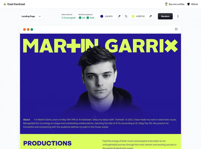
Overview
Cool Contrast is an essential tool designed for developers and designers who prioritize accessibility in their projects. It inspects the contrast between color combinations, ensuring compliance with the accessibility guidelines established by the Web Content Accessibility Guidelines (WCAG). By prioritizing color contrast, users can create visually appealing designs that are also accessible to individuals with visual impairments, promoting an inclusive online experience.
Features
- Accessibility Compliance: Ensures that color schemes meet WCAG standards for contrast, making your designs accessible to a wider audience.
- User-Friendly Interface: Intuitive and easy to navigate, allowing users to quickly check color combinations without a steep learning curve.
- Real-Time Feedback: Instantly analyzes color contrast ratios, giving immediate feedback on compliance levels as you adjust colors.
- Customizable Color Sets: Offers the ability to save and reuse color palettes, streamlining the design process while maintaining accessibility.
- Detailed Reports: Generates comprehensive reports on color combinations, helping users understand areas for improvement and maintain consistent standards.
- Cross-Platform Compatibility: Works seamlessly across different devices and platforms, providing flexibility for users in various environments.
- Educational Resources: Includes tips and guidelines on choosing accessible color combinations, enhancing the user’s knowledge of accessibility best practices.


