 Github Stars:
 Last Commit:
  Created:
Overview
Creating responsive web applications is crucial in today’s digital landscape. This project exemplifies an effective approach to developing an app that adjusts seamlessly to various screen sizes while ensuring a user-friendly experience with interactive features. The completed application not only highlights essential layout principles but also incorporates practical design methodologies that enhance usability across different devices.
As a beginner in web development, embarking on this project has been a learning journey that emphasizes the importance of responsive design, interactivity, and continuous improvement. It serves as a solid foundation for understanding key web technologies and sets the stage for future enhancements in coding proficiency.
Features
Responsive Layout: Automatically adapts the design based on the user’s device screen size, ensuring optimal viewing experiences.
Interactive Hover States: Provides visual feedback through hover effects on clickable elements, enhancing user engagement and interactivity.
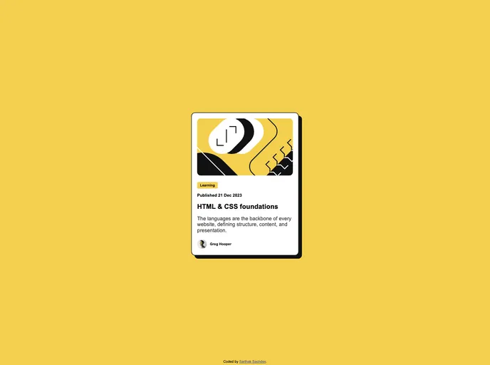
Built with Modern Technologies: Utilizes Semantic HTML5, CSS custom properties, and Flexbox to create a clean and organized code structure.
Optimized Assets: All image assets are pre-optimized and included in the project, guaranteeing fast load times without sacrificing quality.
Extensive Documentation: Includes a style-guide file outlining color palettes and fonts, making it easy to maintain consistency throughout the design.
Development Notes: Comprehensive notes are available to guide beginners through the coding process and transform theoretical concepts into practical skills.
Community Acknowledgment: Recognition of the valuable resources and support offered by industry experts, reinforcing the collaborative nature of the coding community.
Future Development Plans: Acknowledges the necessity for ongoing learning and skill enhancement, focusing on critical web development concepts for gradual improvement.


