 Github Stars:
 Last Commit:
  Created:
Overview
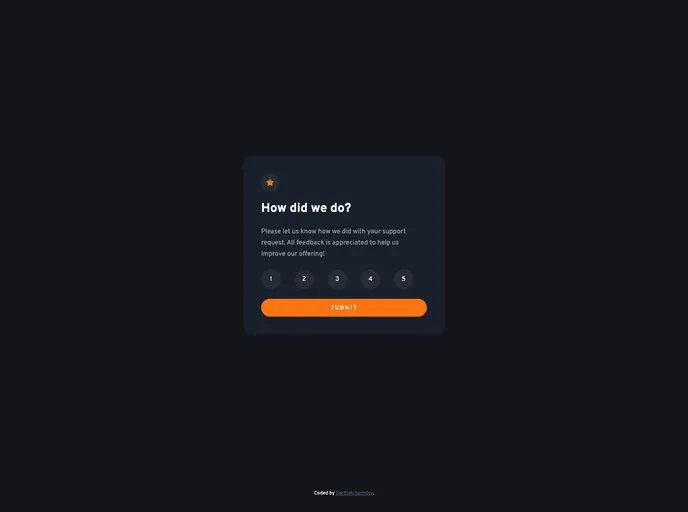
The Interactive Rating Component is a fantastic tool designed to enhance user engagement by collecting valuable feedback effortlessly. With its sleek design and intuitive functionality, this component allows users to rate their experience on a scale from 1 to 5, making it easy to understand how well the application is performing. Additionally, it adjusts its layout based on the device screen size, ensuring an optimal experience whether accessed on a mobile or desktop device.
Not only does it offer visually appealing hover states for all interactive elements, but it also provides users with a delightful ‘Thank you’ card upon submitting their ratings. This thoughtful approach adds a layer of appreciation for user participation, encouraging them to provide feedback without feeling overwhelmed or disengaged.
Features
- Responsive Design: The component adjusts to different screen sizes, ensuring users have an excellent experience on any device.
- User-Friendly Ratings: Allows users to select a rating from 1 to 5, making feedback straightforward and quick.
- Hover States: Interactive elements include hover states that enhance usability and provide visual feedback.
- Thank You Card: After submission, users are presented with a ‘Thank you’ card, which adds a personal touch and appreciation for their engagement.
- Beginner-Friendly: Simple to implement and understand, making it an ideal starting project for aspiring developers.
- Optimized Assets: All necessary assets are included in an optimized format, streamlining the development process.
- Comprehensive Documentation: Style guides and helpful notes are available, providing guidance on design elements like color palettes and fonts.


