Overview
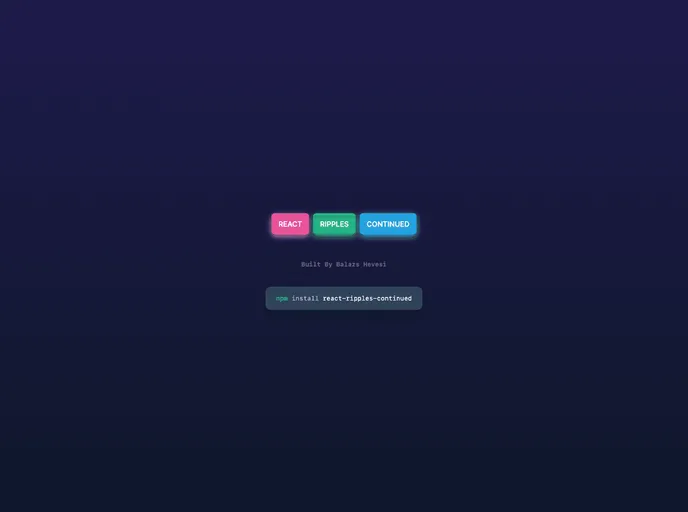
React Ripples Continued is a component that provides a visual ripple effect, commonly used for button click or touch feedback. Inspired by material design principles, this component adds a sleek and interactive element to your React application.
Features
- onType: Determines the event that triggers the ripple effect. Default value is “click”.
- colorType: Sets the color of the ripple effect. Default value is “white”.
- opacityType: Sets the opacity of the ripple effect. Accepts values between 0 (completely transparent) and 1 (completely opaque). Default value is 1.
- blurType: Sets the blur amount for the ripple effect. Default value is 0.
- durationType: Determines the duration of the ripple animation in milliseconds. Default value is 500.
- fillAndHoldType: When set to true, the ripple effect will fill the container and hold its position until a mouse up event occurs. Default value is false.
- optimizeType: When set to true, the ripple elements will be removed from the DOM after the animation completes. Default value is false.
- rippleElementType: When handed JSX, it will display that JSX inside the ripple. Default value is undefined.
Installation
To install the React Ripples Continued component, follow these steps:
Make sure you have React installed in your project.
Run the following command to install the React Ripples Continued package:
npm install react-ripples-continuedImport the component into your React project:
import Ripples from 'react-ripples-continued';
Summary
React Ripples Continued is a powerful component that adds a visually appealing ripple effect to your React application. With customizable props and easy installation, this component is a great choice for implementing material design principles in your UI.


