 Github Stars:
 Last Commit:
  Created:
Overview:
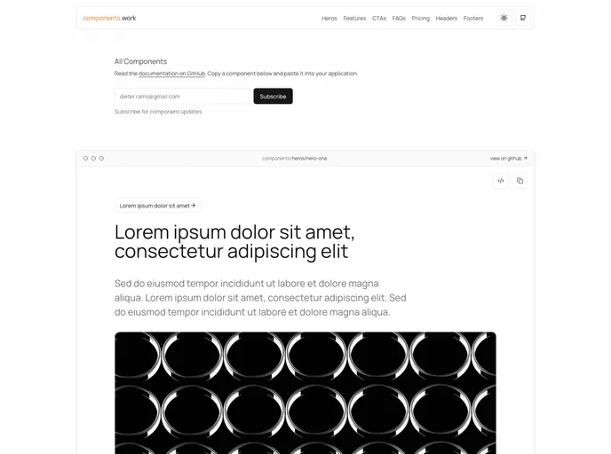
Components is a collection of NextJS components designed for websites that are built using TypeScript, React, shadcn/ui, Craft UI, and Tailwind. This collection was created by Bridger Tower.
Features:
- NextJS Components: Specifically designed for websites built with NextJS.
- TypeScript and React: Utilizes TypeScript and React for robust and efficient development.
- shadcn/ui Integration: Includes components from the shadcn/ui library for enhanced UI design.
- Craft UI Elements: Incorporates elements from the Craft UI library for a dynamic interface.
- Tailwind CSS: Styling is done with Tailwind CSS to ensure responsiveness and flexibility.
Installation:
To install the Components collection, follow these steps:
- Clone the repository from the Components collection.
- Install the necessary dependencies using npm or yarn.
npm install
- Start the development server.
npm run dev
- Begin integrating the Components into your NextJS project.
Summary:
Components is a comprehensive collection of NextJS components that offer a range of features including TypeScript and React integration, shadcn/ui and Craft UI elements, and styling with Tailwind CSS. This collection is ideal for developers looking to enhance their website projects with efficient and dynamic components.


