 Github Stars:
 Last Commit:
  Created:
Overview
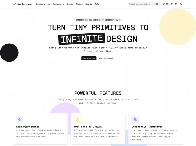
Duck UI is an innovative UI component library crafted for developers seeking flexibility and simplicity in building web application interfaces. With a collection of high-quality React components, it offers a sleek and responsive design that aligns with contemporary UI/UX standards. This library not only enhances user experience but also empowers developers with the tools they need to create visually stunning applications.
The thoughtfully designed components of Duck UI stand out for their customizability and thematic styling options. Perfect for both seasoned developers and novices, the library is backed by extensive documentation that ensures seamless integration into various projects.
Features
- Modern Design: Offers elegant and customizable components that reflect the latest UI/UX trends.
- Flexible Integration: Components are designed for easy incorporation and adaptation to your unique design specifications.
- Themed Styling: Comes with a versatile color palette, including black and white, along with options for personalized themes.
- Comprehensive Documentation: Well-structured guides and resources to help you navigate and utilize Duck UI effectively.
- Community Contributions: Encourages developers to contribute to the library, fostering collaboration and innovation.
- Open Source License: Licensed under the MIT License, allowing for widespread usage and modification.


