 Github Stars:
 Last Commit:
  Created:
Overview
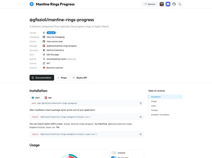
The Mantine Rings Progress component brings a new dimension to data visualization by enhancing the existing RingProgress component from the Mantine UI library. This creative widget allows users to present multiple concurrent metrics in a compact and visually appealing format, utilizing concentric rings. Each ring can be customized with distinct values and colors, providing a clear representation of various data points while offering flexibility in display options, such as incorporating text or emojis.
What makes this component stand out is its ability to accommodate dynamic uses, like countdown timers, while maintaining an aesthetically pleasing design. With customizable size and thickness options, the Rings Progress component is perfect for dashboards, monitors, or compact cards, making it a versatile tool for developers looking to add engaging visual elements to their applications.
Features
- Customizable Rings: Each ring can be individually defined by a value and color, allowing for personalized data visualization.
- Rich Label Options: Supports plain text, emojis, or any React element as labels, providing flexibility in how you present your metrics.
- Compact Design: The concentric layout allows for multiple metrics to be displayed in a single compact widget, ideal for space-constrained dashboards.
- Dynamic Functionality: Perfect for scenarios like countdowns, with the ability to represent different time units using separate rings.
- Style Integration: Includes style imports that align with Mantine’s design principles, ensuring a cohesive look throughout your application.
- User Friendly: Designed to prioritize readability, discouraging inline tooltips that can interfere with viewing the rings.
- Open Source Development: The component is maintained and updated based on community feedback, fostering a collaborative approach to enhancements.


