 Github Stars:
 Last Commit:
  Created:
Overview
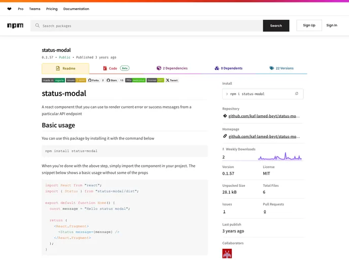
The status-modal component is a powerful tool for managing and displaying error or success messages in React applications. Designed with user experience in mind, it offers a straightforward interface for presenting API responses to users, making notifications clear and visually appealing. This component is particularly useful in scenarios such as user authentication or form submissions, where immediate feedback is crucial.
With its customizable nature and seamless integration into various projects, the status-modal stands out as an essential addition for developers seeking to enhance their applications. Whether you’re building a robust web app or a simple project, this component ensures that your users remain informed about the current status of their actions.
Features
Easy Installation: Quickly integrate the status-modal into your project with a simple installation command, followed by an import statement.
Customizable Styling: By default, the modal has a green theme for successful messages, but users can easily alter styles for error notifications by utilizing the status prop.
Dynamic Import Support: Designed to work seamlessly with Next.js, it enables lazy loading to prevent server-side rendering issues related to the document object.
User Feedback: Effectively communicates user authentication status by displaying relevant messages based on API responses, enhancing overall user experience.
Optional Container ID: Allows developers to customize the wrapperId to avoid conflicts in the DOM or to manage multiple instances of the status-modal.
State Management Compatibility: Works effortlessly with React’s useState() hook, making it easy to manage form states and conditionally render messages.
Contributory Community: Encourages contributions from developers, fostering a collaborative environment for continuous improvement and feature expansion.


