 Github Stars:
 Last Commit:
  Created:
Overview
If you’re working with React and need a robust solution for creating responsive content, yzhan-react-responsive-content might just be what you’re looking for. This powerful and flexible component allows you to generate media queries automatically, making it an excellent choice for developers focused on delivering seamless user experiences across various devices. Unlike traditional conditional rendering methods that can complicate server-side rendering and impact SEO, this component streamlines the process and enhances the visibility of content for search engine crawlers.
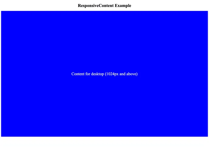
The component’s ability to define flexible content for multiple breakpoints ensures that your users get the best possible experience, whether they are on mobile, tablet, or desktop. With outstanding performance optimization and smart rendering strategies, this tool stands out as an intuitive solution in the React ecosystem.
Features
- Server-side rendering: Works seamlessly with server-side rendering (SSR), eliminating the need for client-side rendering.
- Flexible content definition: Accepts a
setprop that allows for easy content configuration based on different breakpoints, similar tosrcSet. - Versatile content types: Supports multiple content types, including strings, HTML tags, React components, and null values, ensuring flexibility in usage.
- Performance optimized: Utilizes pure CSS to manage media queries without polluting global CSS, enhancing overall performance.
- Customizable display property: Allows users to set the display property according to their layout requirements (block, flex, grid, etc.).
- SEO-friendly: Facilitates content indexing for both desktop and mobile versions simultaneously, improving visibility for search engines.
- Smart wrapper handling: Reuses existing wrapper layers when present, preventing unnecessary DOM nesting and maintaining styling integrity.


