 Github Stars:
 Last Commit:
  Created:
Overview
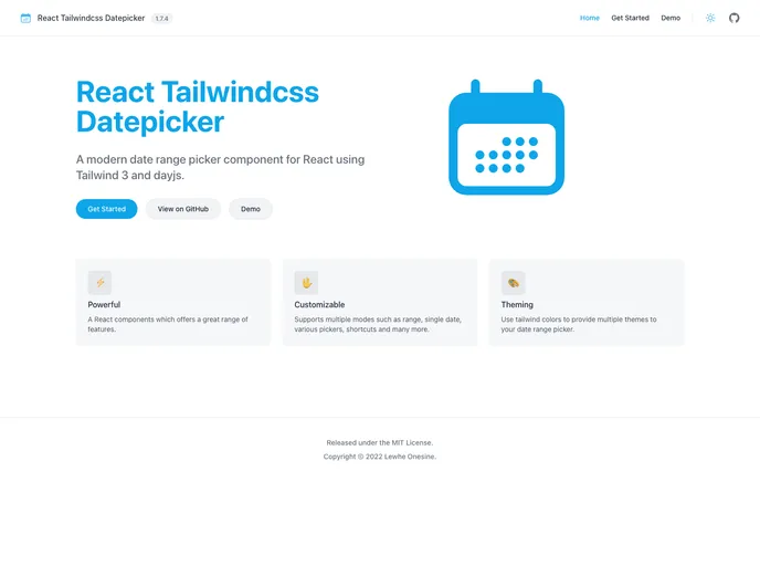
The React Tailwindcss Datepicker is an intuitive date selection component designed to integrate seamlessly into your projects, boasting a sleek design powered by Tailwind CSS. With its robust functionality, it provides users with a fluid experience when selecting dates, making it an excellent addition for developers aiming to enhance their user interfaces.
This datepicker works effectively within React applications and leverages the utility-first approach of Tailwind CSS to ensure a consistent and modern aesthetic. The installation and setup process is straightforward, enabling quick implementation in any project environment.
Features
- Built with Tailwind CSS: Ensures a responsive and stylish design that works harmoniously with your Tailwind frameworks.
- Seamless React Integration: Easily implement the datepicker in your React applications without complex setups.
- Customizable Options: Offers extensive customization, allowing you to tweak the appearance and functionality to fit your project’s requirements.
- User-Friendly Interface: Provides a simple and intuitive user experience, making date selection quick and easy for all users.
- Local Development Support: Comes with clear instructions for setting up the project locally, making it easy for developers to get started.
- Comprehensive Documentation: Guides you through usage and customization, ensuring that both novice and seasoned developers can utilize it effectively.
- Responsive Design: Built to perform beautifully on different screen sizes, ensuring a consistent experience across devices.


