 Github Stars:
 Last Commit:
  Created:
Overview:
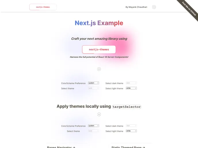
React 18 Themestest is a project that allows users to leverage the full power of React 18 Server Components without the limitations of other similar packages. Inspired by next-themes, React 18 Themestest removes the need to wrap everything in a client-side provider and offers additional features for enhanced customization. With the ability to seamlessly integrate with different build systems, frameworks, and tools for React 18, React 18 Themestest provides a flexible and efficient solution for implementing themes and dark mode in React applications.
Features:
- Fully Treeshakable: The package can be fully treeshaked by importing from
react18-themes/client/component. - Full TypeScript Support: React 18 Themestest offers full TypeScript support for easy integration into TypeScript projects.
- Unleash the full power of React18 Server components: Users can take advantage of the full capabilities of React 18 Server Components.
- Works with all build systems/tools/frameworks for React18: React 18 Themestest is compatible with various build systems, tools, and frameworks used in React 18 projects.
- Perfect dark mode in 2 lines of code: Implementing dark mode in React applications can be done with just two lines of code.
- System setting with prefers-color-scheme: React 18 Themestest supports system settings for color scheme using the
prefers-color-schemefeature. - Themed browser UI with color-scheme: The package provides support for theming the browser UI based on the color scheme.
- Support for Next.js 13 appDir: React 18 Themestest is compatible with Next.js 13 appDir for seamless integration.
- Sync theme across tabs and windows: The theme selected by the user is automatically synchronized across multiple tabs and windows.
- Theme in sync with server component: The theme used by the server component is in sync with the overall theme of the application.
- Disable flashing when changing themes: Users can prevent flashing of un-themed content when changing themes.
- Force pages to specific themes: Pages can be forced to use specific themes by configuring the package accordingly.
- Class or data attribute selector: Users have the option to select themes using either class or data attribute selectors.
- Manipulate theme via useTheme hook: The useTheme hook allows users to access and manipulate the current theme in their components.
Installation:
To install React 18 Themestest, follow these steps:
- Install the package from npm:
npm install react18-themes
- Make sure to also install Zustand as a peer-dependency:
npm install zustand
- Add a Custom App to use by modifying the
_appfile in your project:
import React from 'react';
import { ThemeSwitcher, ServerSideWrapper } from 'react18-themes';

function MyApp({ Component, pageProps }) {
  return (
    <ServerSideWrapper>
      <ThemeSwitcher>
        <Component {...pageProps} />
      </ThemeSwitcher>
    </ServerSideWrapper>
  );
}

export default MyApp;
- Add dark mode support to your app by adding the following code:
import React from "react";
import { useTheme, ServerSideWrapper } from "react18-themes";

function Layout({ children }) {
  const { setTheme } = useTheme();

  React.useEffect(() => {
    setTheme('dark');
  }, []);

  return (
    <ServerSideWrapper>
      {/* Rest of your layout */}
      {children}
    </ServerSideWrapper>
  );
}

export default Layout;
By following these steps, you have successfully installed and integrated React 18 Themestest into your Next.js app.
Summary:
React 18 Themestest is a powerful package that allows users to leverage the full capabilities of React 18 Server Components for implementing themes and dark mode in React applications. With its support for different build systems, frameworks, and tools for React 18, React 18 Themestest provides flexibility and ease of use. The package offers features like perfect dark mode implementation in just two lines of code, support for system settings and theming the browser UI, and the ability to sync themes across tabs and windows. With React 18 Themestest, developers can easily create visually appealing and customizable React applications.


